Predicting typical completion rates of online courses
140 lines of code (Python)
Massive open online courses (MOOCs) did not revolutionize education. Why? They suffer from abysmal completion rates. Most students start a MOOC without finishing it. In this blog post I take a look at what my own company's e-learning course completion rates would be if we offered standard MOOCs.

How many people complete MOOCs?
When I joined StackFuel, a company which offers online courses in data science, I was very surprised.
Apparently, e-learning courses suffer from a fatal flaw: incredibly low completion rates.
Let’s take a look at a dataset of MOOC completion rates assembled by Katy Jordan.
I save it as a DataFrame called df.
import pandas as pd
df = pd.read_pickle('MOOC_complete_data.p')
In many ways the MOOCs in this dataset differ from courses offered by my employer StackFuel. The MOOCs in this dataset are:
- mostly based on humanities subjects
- quite old (mostly from 2013)
- mostly without individual support
- probably free or extremely cheap
Despite the differences, it is interesting to take a look at the completion rates as a function of course duration.
The following code takes the dataset and draws a scatter plot.
Note that the function nuss_style_fun() enforces a style advocated by Cole Nussbaumer Knaflic.
You can find the code here or at the end of the post.
# module import
import matplotlib.pyplot as plt
import matplotlib.ticker as mtick

# initialise figure and axes
fig, ax = plt.subplots(figsize=[8, 4])
ax = nuss_style_fun(ax=ax, title='Most MOOCs are short\nwith low completion rate')

# draw scatter plot
df.plot(kind='scatter',
        x='Course duration',
        y='% completed',
        c='darkred',
        s=20,
        alpha=0.5,
       ax=ax)

# set labels
ax.set(ylim=[0, 100],
       xlabel='Course duration [weeks]',
       ylabel='Completion rate')

# change font color of legend
l = ax.legend(['Individual MOOC'])
for text in l.get_texts():
    text.set_color((0.41, 0.41, 0.41))

# y-tick-labels as %
fmt = '%.0f%%' # Format you want the ticks, e.g. '40%'
yticks = mtick.FormatStrFormatter(fmt)
ax.yaxis.set_major_formatter(yticks)

#author line
fig.text(0.99, 0.01, '@rikunert', color='lightgrey', style='italic',
         horizontalalignment='right')

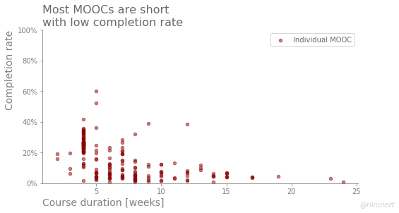
The figure shows that most MOOCs are short (mode at 4 weeks) and the completion rates are across the boards low. Hardly any MOOC has a completion rate higher than 50%.
Modelling MOOC completion rates
In order to predict completion rates, we need a model. So, let’s use only one feature ('Course duration') to predict the target ('% completed').
Instead of deciding by myself what the best model ought to be, I use a grid search in conjunction with a five-fold cross validation.
I am particularly interested in the polynomial term of the regression model.
# module import
from sklearn.pipeline import Pipeline
from sklearn.preprocessing import PolynomialFeatures
from sklearn.linear_model import LinearRegression
from sklearn.model_selection import GridSearchCV

# features matrix and target vector
mask = (pd.isna(df['Course duration'])==False) &
    (pd.isna(df['% completed'])==False)  # no missing values
features = df.loc[mask, ['Course duration']]
target = df.loc[mask, '% completed']

# prepare grid search arguments
pipe = Pipeline([('poly', PolynomialFeatures()),
                  ('reg', LinearRegression())])

search_space = [{'poly__degree':[1, 2, 3, 4],
                'reg':[LinearRegression()]}]

# instantiate grid search
model=GridSearchCV(estimator=pipe,
                  param_grid=search_space,
                  cv=5,
                  scoring='neg_mean_absolute_error')

# fit model
model.fit(X=features,
          y=target)

# print prediction error
print('Average prediction error: ', abs(model.best_score_))
The best performing model uses a third degree polynomial regression.
Its average prediction error is not terrific: 8.4 %-points.
We can now visualise the regression line of the best performing model.
import numpy as np
x_fit = np.linspace(0,
                    df.loc[:, 'Course duration'].max(),
                    100)
features_fit = pd.DataFrame({'Course duration': x_fit})
ax.plot(x_fit,
        model.predict(features_fit),
       linewidth=3)

title_str = 'The longer the MOOC\nthe lower the completion rate'
ax.set_title(label=title_str,
                 loc='left',
                 color=(0.41, 0.41, 0.41),
                 size=16)

# change font color of legend
l = ax.legend(['Polynomial fit', 'Individual MOOC'])
for text in l.get_texts():
    text.set_color((0.41, 0.41, 0.41))

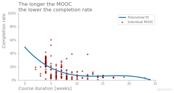
We can clearly see that the longer the longer a MOOC takes, the lower the completion rate. However, from a duration of about 10 weeks onwards, completion rates are relatively stable until 20 weeks. Thereafter there are hardly any data points to trust the model.
Predicting completion rates
What does this mean for the courses I create at StackFuel? In many ways, data science courses at StackFuel are not comparable to the MOOCs of this data set. But let’s just assume the MOOCs of six years ago could be representative of modern interactive e-learning courses. What completion rates would one expect?
I use the best performing model and predict completion rates for the three course durations StackFuel currently offers: 4 weeks, 12 weeks and 18 weeks.
features_aim = pd.DataFrame({'Course duration': [4, 12, 18]})
target_aim_pred = model.predict(features_aim)
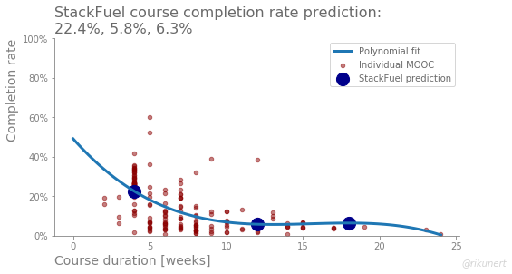
Completion rates of 22% for the four week course and around 6% for the two longer courses are predicted. We can add these as big blue dots to the figure.
# add predicted values to scatter plot
ax.scatter(x=features_aim['Course duration'],
                y=target_aim_pred,
                c='darkblue',
                s=200)

# change font color of legend
l = ax.legend(['Polynomial fit', 'Individual MOOC', 'StackFuel prediction'])
for text in l.get_texts():
    text.set_color((0.41, 0.41, 0.41))

# change title
title_str = 'StackFuel course completion rate prediction:\n22.4%, 5.8%, 6.3%'
ax.set_title(label=title_str,
                 loc='left',
                 size=16)

While one should expect a better completion rate for StackFuel’s shorter course, the other two should be quite similar.
Summary
According to cross validation, the completion rates I predicted with this model are likely off by about 8%-points. Moreover I am quite doubtful whether the dataset is all that representative of modern data courses. But the following insights are interesting and might generalise:
- course duration is only a problem up to a point, specifically up to a course duration of about 10 weeks
- between 10 and 20 weeks course duration, the completion rates are relatively stable
- below 10 weeks, completion rates decline fast with increasing course duration
While I am not at liberty to reveal the completion rates of StackFuel courses, I can say that I was relieved when I found this dataset. Apparently, we are much better than the MOOCs of six years ago. I must be doing something right.
The code for the nuss_style_fun() function is this:
def nuss_style_fun(ax, title):

    #remove top and right frame parts
    ax.spines['top'].set_visible(False)
    ax.spines['right'].set_visible(False)

    # set left and bottom axis to grey
    ax.spines['left'].set_color('grey')
    ax.spines['bottom'].set_color('grey')

    # set ticks to grey
    ax.tick_params(axis='x', colors='grey')
    ax.tick_params(axis='y', colors='grey')

    #set labels to grey
    ax.yaxis.label.set_color('grey')
    ax.xaxis.label.set_color('grey')

    # align axis labels with axis ends
    ax.set_xlabel(xlabel=None,
                  position=[0, 0],
                  horizontalalignment='left',
                  color='grey',
                  size=14)
    ax.set_ylabel(ylabel=None,
                  position=[0, 1],
                  horizontalalignment='right',
                  color='grey',
                  size=14)

    #align title
    ax.set_title(label=title,
                 loc='left',
                 color=(0.41, 0.41, 0.41),
                 size=16)

    return ax
The complete code to recreate the analyses and plots of this blog post can be found on github here.
Like this post? Share it with your followers or follow me on Twitter!