Using geographical heat maps to visualise cultural influence
100 lines of code (Python)
Streets, squares and places in general tend to be named after influential people. As a consequence, place names offer a glimpse into who shaped local cultures. In this post, I use open street map data in order to visualise the influence of different historical figures in Germany.
Querying open street map data
In order to find out where geographical entities are named after certain historical figures, we need a data base of place names and coordinates. In this post, we will use the volunteer project open street map for that.
One can query the open street map data base with the Python module overpy. Before we write the function to do that, let’s first import the modules we’ll need for this project.
import overpy
import time
import matplotlib.pyplot as plt
import pandas as pd
import geopandas as gpd
import numpy as np
from scipy import ndimage
The API of open street map is thankfully explained here. We follow this guide and write a query_str which defines which text we want to look for in the place names of which country. All the place names which match the text are saved in the local variable df together with their latitude and longitude. The function run_overpy_query() does all that.
API_WAIT_TIME = 60  # seconds
def run_overpy_query(search_term, country_code='DE'):

    api=overpy.Overpass()
    query_str = '''
    area["ISO3166-1"="{0}"][admin_level=2];
    (node["name"~"{1}", i](area);
    way["name"~"{1}", i](area);
    rel["name"~"{1}", i](area);
    );
    out center;
    '''.format(country_code, search_term)
    try:
        r = api.query(query_str)
    except:
        print('Query unsuccessful. Wait {} seconds and try again.'.format(API_WAIT_TIME))
        time.sleep(API_WAIT_TIME)
        r = api.query(query_str)

    # extract coordinates from query result
    coords  = []
    coords += [(float(node.lon), float(node.lat)) for node in r.nodes]
    coords += [(float(way.center_lon), float(way.center_lat)) for way in r.ways]
    coords += [(float(rel.center_lon), float(rel.center_lat)) for rel in r.relations]
    df = pd.DataFrame(coords)
    df.columns = ['lon', 'lat']

    return df
Please note that, as with many APIs, we can run into a rate limitation if we query too often. Waiting 60 seconds (API_WAIT_TIME) should fix that.
Let’s try out the function to see where Germany’s first modern chancellor, Konrad Adenauer, gets honored.
df_ka = run_overpy_query(search_term='adenauer')
df_ka.head()
The result looks like this:
lat |
long |
|---|---|
| 9.988323 | 48.388831 |
| 8.692704 | 49.407714 |
| 6.273176 | 50.887146 |
| 13.307399 | 52.500242 |
| 8.929486 | 48.466880 |
No, I also don’t know where these places are. But we can turn to a map of Germany to find out.
Visualising open street map data
Before we turn to the heat map, it is worth plotting the results first with a simple scatter plot.
def visualise_osm_scatter(search_term, title_name, country_code='DE', author_line=True):
    df = run_overpy_query(search_term=search_term, country_code=country_code)
    world = gpd.read_file('PATH\\TO\\SHAPE\\FILE\\FOLDER\\ne_10m_admin_1_states_provinces\\ne_10m_admin_1_states_provinces.shp')
    fig, ax = plt.subplots(figsize=[8, 9.5])
    ax.axis('off')
    world[world['iso_a2']=='DE'].plot(color='w', edgecolor='black', linewidth=0.5, ax=ax)
    ax.scatter(df['lon'], df['lat'], c='red')
    ax.set_title('Location of the {} places\nnamed after {}\n'.format(len(df), title_name),
                 color=(0.41, 0.41, 0.41),
                 size=20)
    #author line
    if author_line:
        fig.text(0.99, 0.01, '@rikunert', color='lightgrey', style='italic',
             horizontalalignment='right')

    return fig, ax
Note how we first query the API using our new function run_overpy_query() and then visualise the results with ax.scatter(). For reference, I use a map of Germany with federal state borders (world) which I got from here. Otherwise, the function sets a title on top and an author line in the bottom right hand corner.
The result looks like this:
fig, ax = visualise_osm_scatter('adenauer', 'Konrad Adenauer')
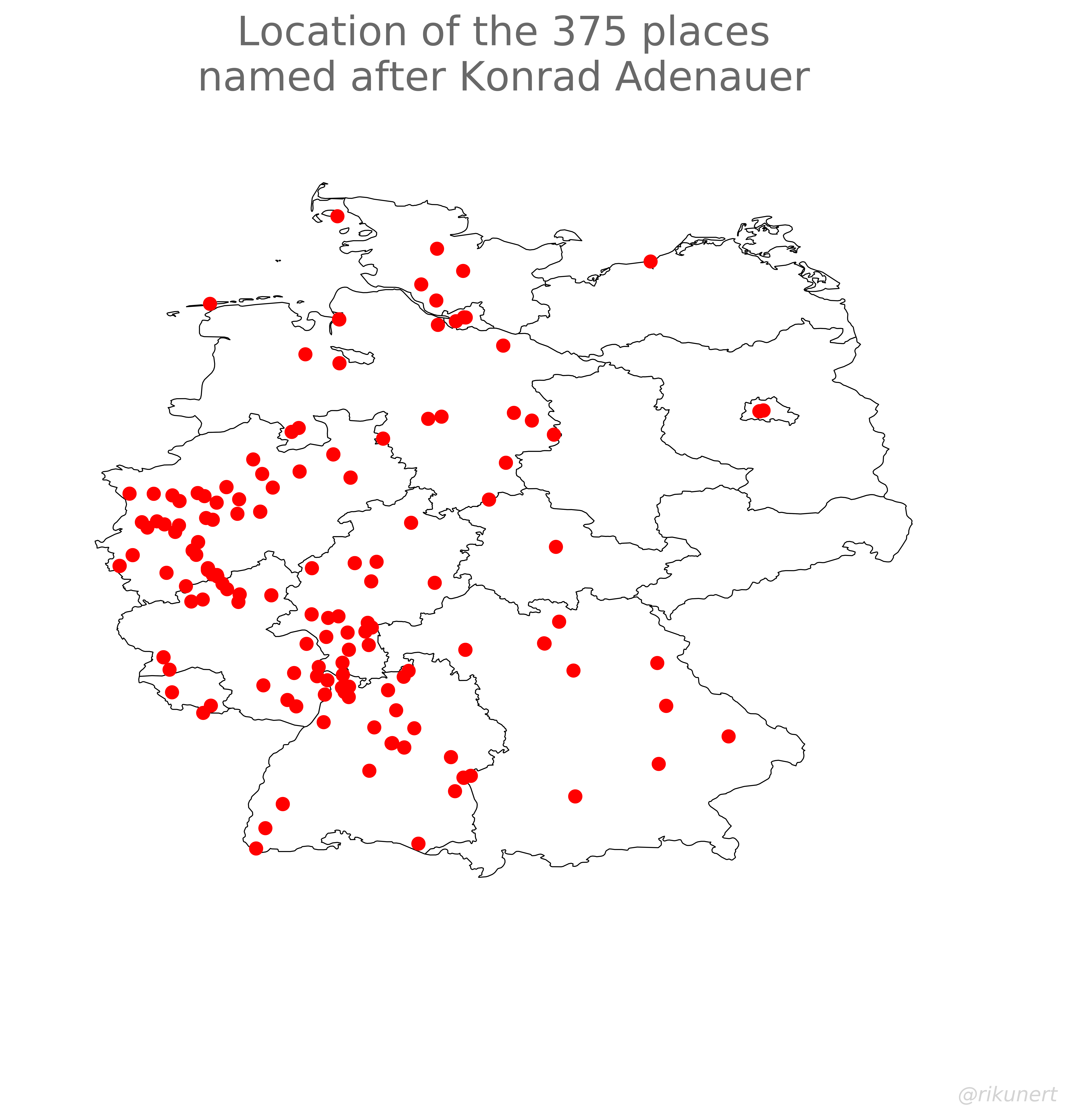
Apparently, the first political leader of West Germany gets honored in place names all over, well, West Germany. Thirty years after the reunification of Germany he hardly has any place named after him in the former East.
We can get a better overall picture by combining nearby dots on the map into areas. These appear “hot” on a heat map. We adjust the plotting function accordingly.
def visualise_osm(search_term, title_name, country_code='DE', plot='heatmap', author_line=True):

    df = run_overpy_query(search_term=search_term, country_code=country_code)

    # plot query results on map of Germany
    world = gpd.read_file('PATH\\TO\\SHAPE\\FILE\\FOLDER\\ne_10m_admin_1_states_provinces\\ne_10m_admin_1_states_provinces.shp')
    fig, ax = plt.subplots(figsize=[8, 9.5])
    ax.axis('off')
    if plot=='scatter':
        world[world['iso_a2']=='DE'].plot(color='w', edgecolor='black', linewidth=0.5, ax=ax)
        ax.scatter(df['lon'], df['lat'], c='red')
    elif plot=='heatmap':
        # see https://nbviewer.jupyter.org/gist/perrygeo/c426355e40037c452434
        smoothing = 30  # smoothing factor
        bins=1000  # "pixel count"
        cmap='hot'  # color scale
        xlim = [5.7, 15.2]  # East-West extent of Germany
        ylim = [47.1, 55.1]  # North-South extent of Germany
        heatmap, xedges, yedges = np.histogram2d(df['lat'], df['lon'],
                                                 bins=bins, range=[ylim, xlim])
        extent = [yedges[0], yedges[-1],
                  xedges[-1], xedges[0]]
        logheatmap = np.log(heatmap)
        logheatmap[np.isneginf(logheatmap)] = 0
        logheatmap = ndimage.filters.gaussian_filter(logheatmap, smoothing, mode='nearest')  # smooth out peaks
        logheatmap[logheatmap < 0.0001] = 0  # clearly show areas without occurence
        logheatmap = np.max(logheatmap) - logheatmap  # reverse color scale

        world[world['iso_a2']=='DE']['geometry'].boundary.plot(color='k', edgecolor='black', linewidth=0.2, ax=ax)
        ax.imshow(logheatmap, cmap=cmap, extent=extent)
        ax.invert_yaxis()
        ax.set(xlim=xlim, ylim=ylim)

    ax.set_title('Location of the {} places\nnamed after {}\n'.format(len(df), title_name),
                    color=(0.41, 0.41, 0.41),
                    size=20)
    #author line
    if author_line:
        fig.text(0.99, 0.01, '@rikunert', color='lightgrey', style='italic',
             horizontalalignment='right')

    return fig, ax
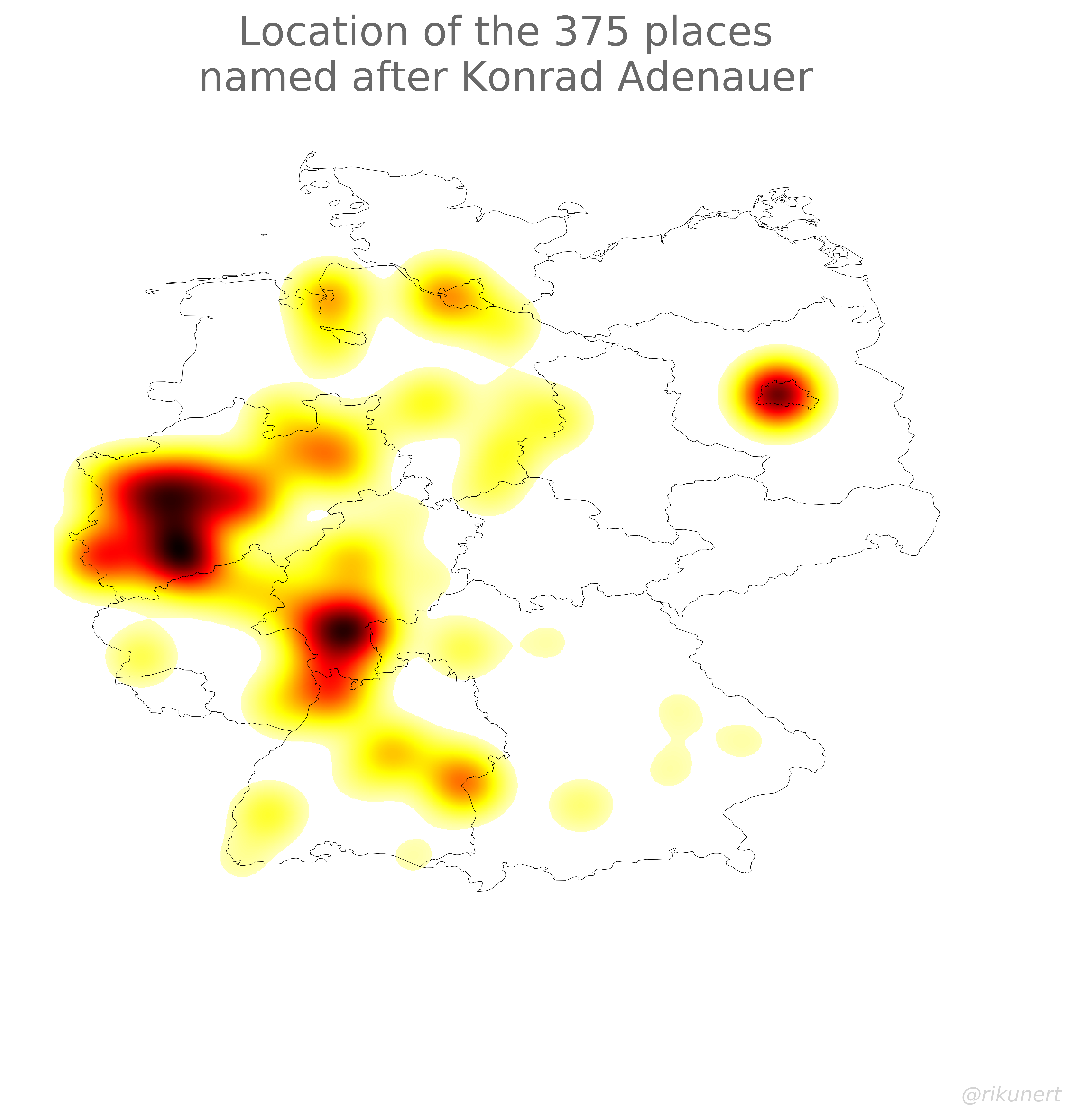
Under the hood the heat map is a 2D histogram (np.histogram2d()). It’s as if we layed a grid onto the map of Germany and counted how many red dots appear in each cell. This 2D histogram then gets smoothed (ndimage.filters.gaussian_filter()), i.e. the values of nearby cells are averaged. I plot the result using ax.imshow().
Let’s try it out.
fig, ax = visualise_osm_scatter('adenauer', 'Konrad Adenauer')

Three hot spots of Adenauer commemoration are obvious: Berlin, Frankfurt, and the Ruhr region. This was not as obvious when using a scatter plot.
East-west differences
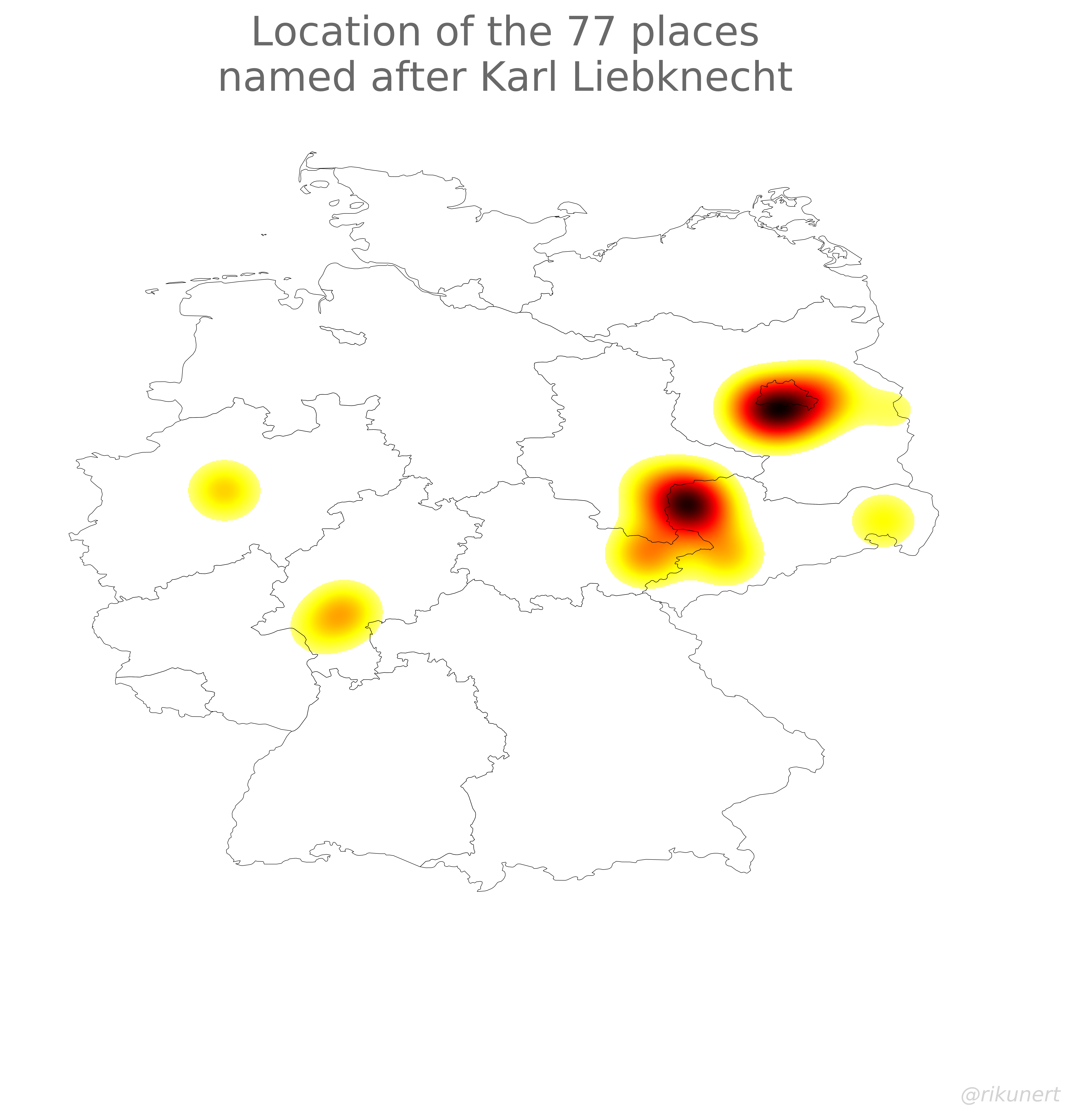
While the first West German chancellor gets commemorated nearly exclusively in West Germany, East Germany also features historical figures which are only honored there. Two examples are famous socialist leaders of the 1918 revolution.
Karl Liebknecht:
fig, ax = name_locator('karl-liebknecht', 'Karl Liebknecht')
Rosa Luxemburg:
fig, ax = visualise_osm('rosa-luxemburg', 'Rosa Luxemburg', plot='heatmap')
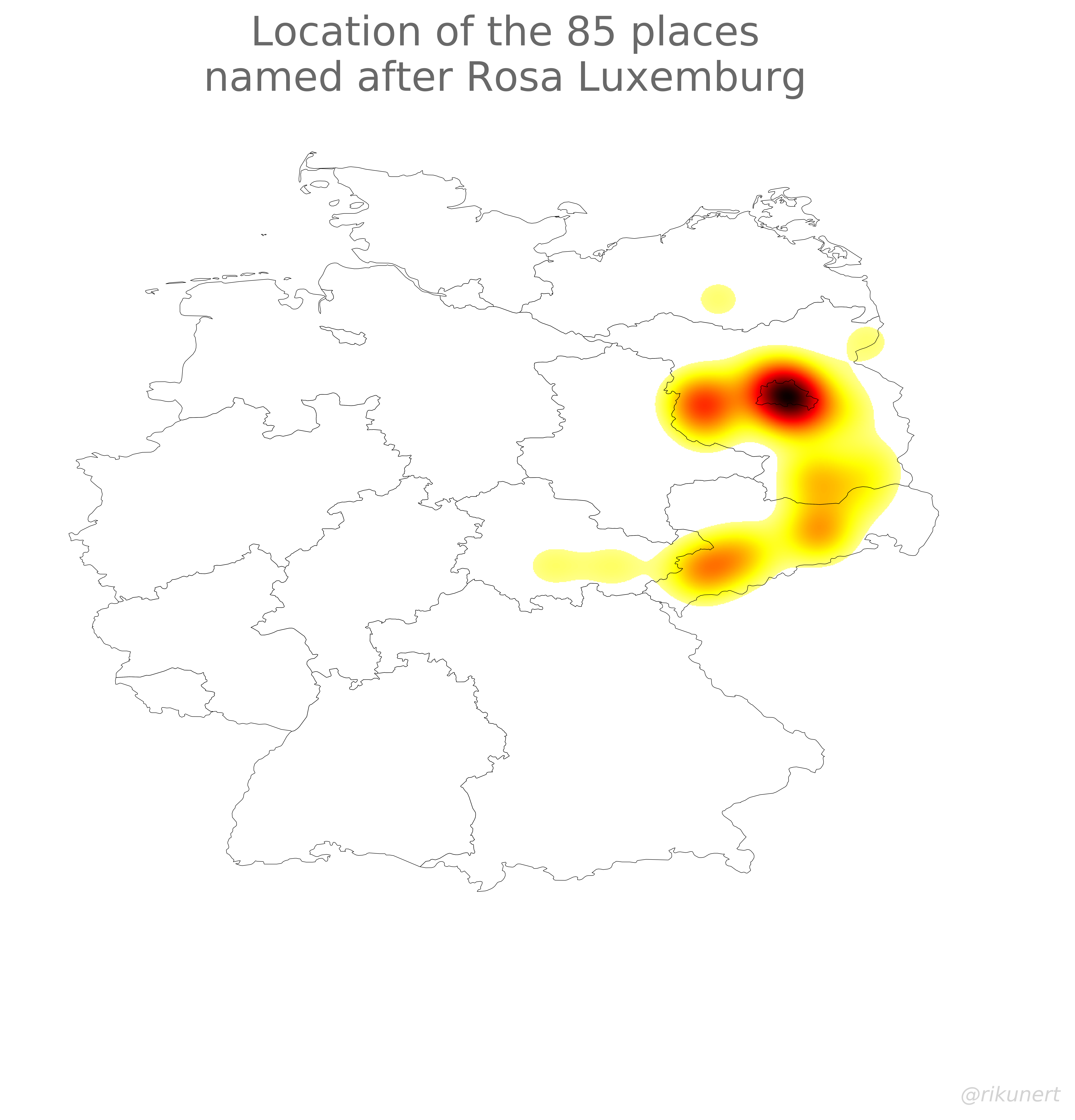
Note how these two figures are nearly exclusively honored in East German place names. The socialist past of this part of Germany is still very much visible.
Another interesting figure is Paul von Hindenburg. Second president of the Weimar Republic who appointed Hitler as chancellor. Where can we find this controversial historical person in place names?
fig, ax = visualise_osm('hindenburg', 'Paul von Hindenburg', plot='heatmap')
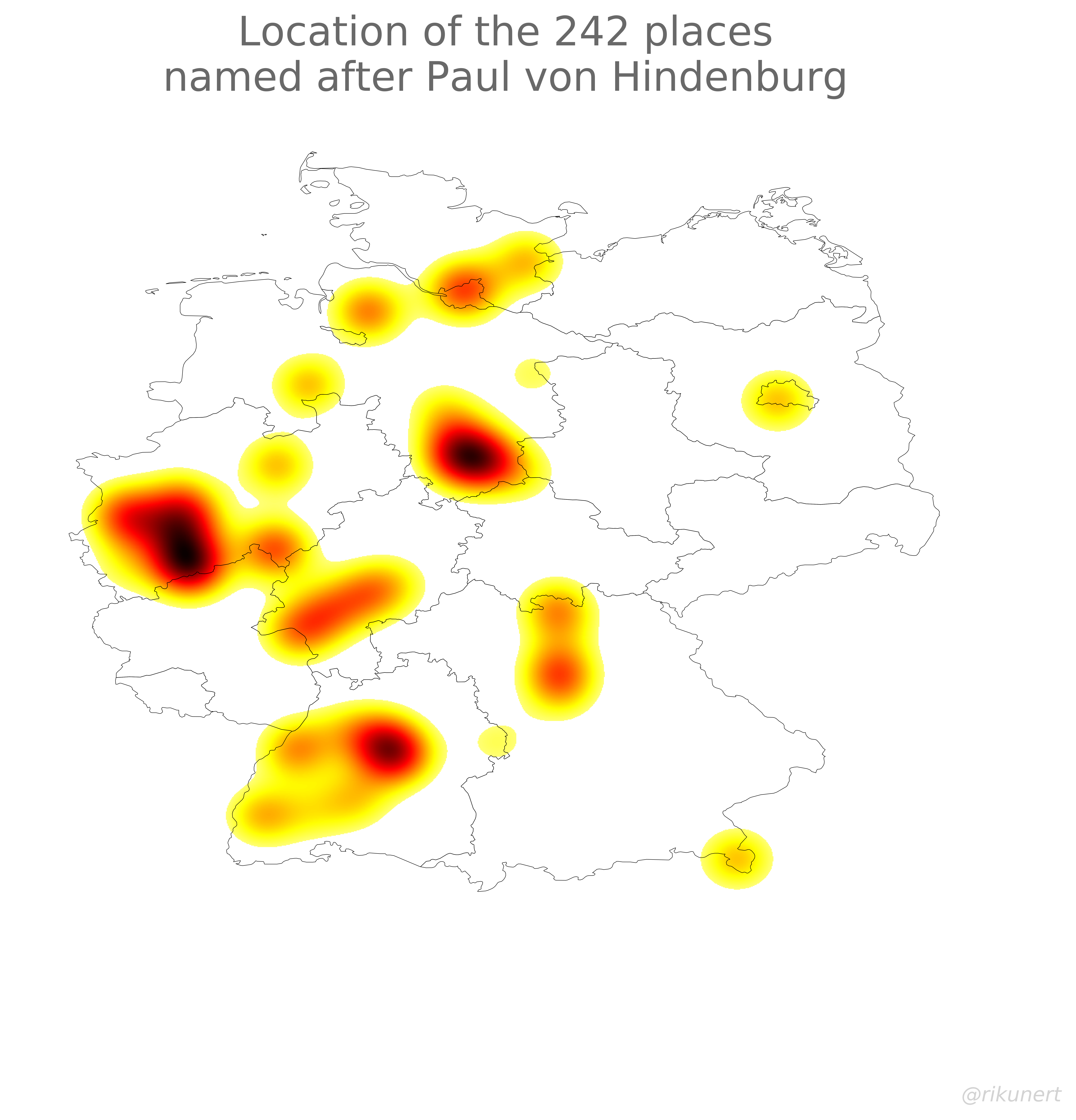
Turns out Hindenburg is nearly only found in West German place names. Germany’s cultural east-west divide is still clearly visible in how geographical entities are named.
Local influence
We can even go further back in time and reveal an enduring influence of historical personalities. Take Martin Luther, a 16th century religious figure who founded the protestant church.
fig, ax = visualise_osm('luther', 'Martin Luther', plot='heatmap')
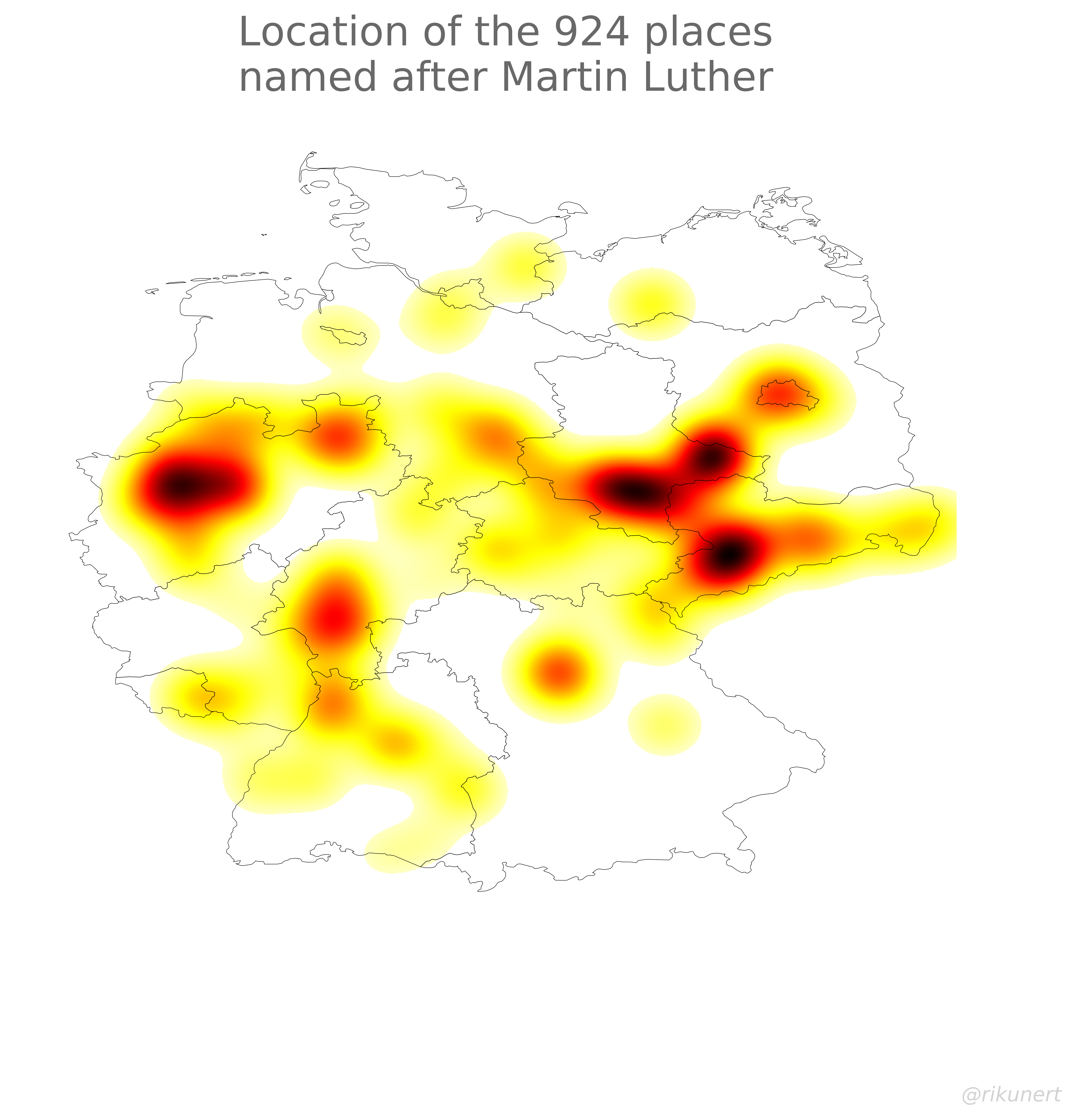
That Eastern cluster of hot spots are exactly the places where Martin Luther lived. That influence is still visible today. Also interestingly, the protestant north of Bavaria honors Luther in place names while the catholic south does not.
Conclusion
Heatmaps of place names today can be used to track cultural differences between different regions of Germany. However, the approach used in this post has some caveats:
- Densely populated regions, like the Ruhr region, can appear hot by chance because the denser the population of a region, the more place names there are there in general in this region.
- The open street map data is based on volunteer submissions and, thus, does not offer a complete picture of place names in Germany.
Nonetheless, as the examples in this post show, a Germany wide scan of place names is possible using open street map. It reveals the local history of Germany.
The complete code to recreate the analyses and plots of this blog post can, as always, be found on github here.
Like this post? Share it with your followers or follow me on Twitter!