Exponentially scaling your data in order to zoom in on small differences
100 lines of code (Python)
Machine learning models benefit from zooming in on the area of a scale where most data points show differences. In this blog post I present an exponential scaler which does exactly that. It zooms in on the lower or higher end of the scale in order to focus a machine learning model on the differences that count the most.

Developing a zooming function into small differences between data points
Many measures show so-called floor effects. Nearly all data points are near the floor of the scale. Take conversion rate for example. The likelihood to purchase a product is typically very low except for highly unusual super shoppers. Therefore, modeling conversion rate might benefit from zooming in on small differences near the bottom of the scale.
Zooming in on small differences between data points is equivalent to increasing the distance between scores at the lower end of the scale and reducing the distance between scores at the higher end of the scale. Ideally, we would want a function which zooms in on the end of the scale where most data points lie. Such a scaling function should allow the user to control how extreme the zoom is.
Many text books suggest the transformation 1/x.
Another way to write this is x**(-1), the score x to the power of -1.
The exponent -1 controls how extreme the zoom is. The further away from zero, the stronger the zoom.
While this is the core of the exponential scaler function exp_scale_fun() which I present in this blog post, I want to add three small adjustments.
I want the exp_scale_fun() to not only have a variable scaling parameter via the exponent, I want it to also:
- scale scores below zero similarly to scores above zero
- retain the order of the data
- retain the minimum and maximum scores
The result is the following function:
def score_scale_fun(X, scores_old_min, scores_old_max, scores_new_min=0, scores_new_max=1):
    X = scores_new_max - ((scores_new_max - scores_new_min) * (scores_old_max - X) / (scores_old_max - scores_old_min))
    return X

def exp_scale_fun(X, exponent=-1):
    X_transformed = (X + 1)**(exponent)
    if exponent < 0:
        X_transformed = 1 - X_transformed
    X_transformed_scaled = score_scale_fun(X_transformed, X_transformed.min(), X_transformed.max(), X.min(), X.max())
    return X_transformed_scaled
Let’s focus on exp_scale_fun() for the moment. It takes two arguments: the data to be transformed X and the exponent which controls the zoom level exponent.
It first adds 1 to the data in order to satisfy the first extra property (scale scores below zero similarly to scores above zero).
After the transformation via the exponent, it reverses the data if the exponent is negative. This is done to satisfy the second extra property (retain the order of the data).
It then uses the function score_scale_fun() in order to ensure that the minimum and maximum of the original and transformed data are the same (third extra property).
I developed score_scale_fun() in a previous blog post.
Visualising the effect of the exponential scaler
In order to get a feeling for how exp_scale_fun() transforms data, it is best to visualise original data and the transformed data together.
Let’s start by generating a DataFrame with 101 scores equally spaced between 0 and 1 inclusive.
import numpy as np
import pandas as pd
data = np.linspace(0, 1, 101)
df = pd.DataFrame({'original data': data}, index=data)
We will try out five different negative exponents which zoom in on small differences to an increasing extent.
for exponent in [-1, -2.5, -5, -10, -20]:
    df['exponent: {}'.format(exponent)] = exp_scale_fun(df, exponent=exponent).iloc[:, 0]
df.head()
The head of the DataFrame now looks like this:
| original data | exponent: -1 | exponent: -2.5 | exponent: -5 | exponent: -10 | exponent: -20 |
|---|---|---|---|---|---|
| 0.00 | 0.000000 | 0.000000 | 0.000000 | 0.000000 | 0.000000 |
| 0.01 | 0.019802 | 0.029845 | 0.050100 | 0.094806 | 0.180456 |
| 0.02 | 0.039216 | 0.058673 | 0.097310 | 0.179827 | 0.327029 |
| 0.03 | 0.058252 | 0.086529 | 0.141823 | 0.256156 | 0.446325 |
| 0.04 | 0.076923 | 0.113454 | 0.183817 | 0.324753 | 0.543614 |
We can find the desired properties back in the transformed data:
- The minimum (
0.00) remains unchanged; see first row below header. The same is true for the maximum but this is not visible in the head of theDataFrame. - The order of the scores is unchanged: they increase in all columns when going down the rows.
- When going from left to right, we can see how the zoom gets increasingly more extreme. The bottom 1% of the scale get exaggerated to be the the bottom 2% of the scale when transformed with
exp_scale_fun()andexponent=-1. This zoom is even more extreme in the right most column (exponent=-20). There the zoom on the bottom 1% of the scale is 18 fold.
The function transformation_viz_fun() visualises original data (x-axis) and transformed data (y-axis).
import matplotlib.pyplot as plt
def transformation_viz_fun(df, title, reverse_legend=False):

        # initialise plot
        fig, ax = plt.subplots()

        # draw line chart
        df.plot(cmap=plt.get_cmap('viridis'),
                ax=ax)

        # adjust style
        ax = nuss_style_fun(fig, ax, title=title)

        # label axes
        ax.set(xlabel='Original scale',
              ylabel='Transformed scale')

        # reverse legend labels
        if reverse_legend:
            handles, labels = ax.get_legend_handles_labels()
            ax.legend(reversed(handles), reversed(labels))

        return fig, ax
Note that the visualisation function enforces a style advocated by Cole Nussbaumer Knaflic. I implemented it in Python like this:
def nuss_style_fun(fig, ax, title, author_line=True):

    #remove top and right frame parts
    ax.spines['top'].set_visible(False)
    ax.spines['right'].set_visible(False)

    # set left and bottom axis to grey
    ax.spines['left'].set_color('grey')
    ax.spines['bottom'].set_color('grey')

    # set ticks to grey
    ax.tick_params(axis='x', colors='grey')
    ax.tick_params(axis='y', colors='grey')

    #set labels to grey
    ax.yaxis.label.set_color('grey')
    ax.xaxis.label.set_color('grey')

    # align axis labels with axis ends
    ax.set_xlabel(xlabel=None,
                  position=[0, 0],
                  horizontalalignment='left',
                  color='grey',
                  size=14)
    ax.set_ylabel(ylabel=None,
                  position=[0, 1],
                  horizontalalignment='right',
                  color='grey',
                  size=14)

    #align title
    ax.set_title(label=title,
                 loc='left',
                 color=(0.41, 0.41, 0.41),
                 size=20)

    #author line
    if author_line:
        fig.text(0.99, 0.01, '@rikunert', color='lightgrey', style='italic',
             horizontalalignment='right')

    return ax
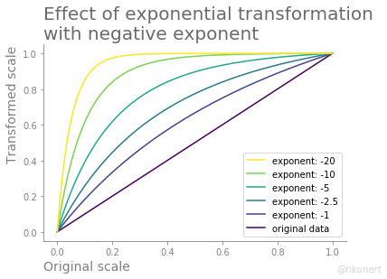
The resulting line chart shows how score differences at the lower end of the scale get exaggerated while score differences at the upper end of the scale are reduced.
fig, ax = transformation_viz_fun(df, title='Effect of exponential transformation\nwith negative exponent', reverse_legend=True)

There are three things to note in this plot:
- The original and transformed data have the same minimum and maximum scores.
- The order of the scores also remains unchanged.
- The more the exponent is away from zero, the more the transformed data lines deviate from the original data line.
Positive exponents
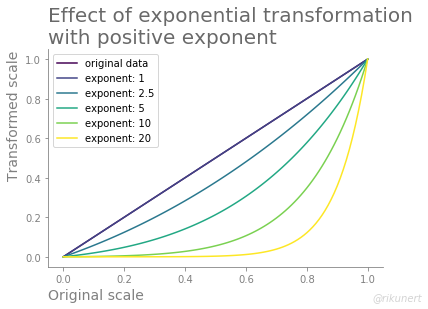
If you desire the opposite behaviour, i.e. an zooming into the upper end of the scale, just use a positive exponent. This is useful when the data show a so-called ceiling effect, i.e. most data points cluster around the top of the scale.
We can use nearly the same code again in order to observe the effect.
data = np.linspace(0, 1, 101)
df = pd.DataFrame({'original data': data}, index=data)
for exponent in [1, 2.5, 5, 10, 20]:
    df['exponent: {}'.format(exponent)] = exp_scale_fun(df, exponent=exponent).iloc[:, 0]
df.head()
The head of the DataFrame shows only the lower end of the scale.
Notice how the lowest 1% get shrunk to the lowest 0.5% when using exponent=2.5.
| original data | exponent: 1 | exponent: 2.5 | exponent: 5 | exponent: 10 | exponent: 20 |
|---|---|---|---|---|---|
| 0.00 | 0.00 | 0.000000 | 0.000000 | 0.000000 | 0.000000 |
| 0.01 | 0.01 | 0.005409 | 0.001645 | 0.000102 | 0.000000 |
| 0.02 | 0.02 | 0.010898 | 0.003357 | 0.000214 | 0.000000 |
| 0.03 | 0.03 | 0.016469 | 0.005138 | 0.000336 | 0.000000 |
| 0.04 | 0.04 | 0.022122 | 0.006989 | 0.000469 | 0.000000 |
What would the original and transformed data look like together in the line chart?
fig, ax = transformation_viz_fun(df, title='Effect of exponential transformation\nwith positive exponent', reverse_legend=False)

Notice how an increasingly large exponent leads to an increasingly large deviation of the transformed data from the original data.
Conclusion
In my experience it is worth exaggerating small differences in many features and often also in the target variable of a machine learning problem. Feature engineering can use such transformations in order to help a machine learning model to focus on the low or upper end of a scale. However, take care and experiment a bit when using the exponential scaler if:
- the exponent lies between -1 and 1 (I only used exponents outside this range)
- your data is very large (the effect does not scale linearly for larger data)
Let me know if exp_scale_fun() has helped you to improve your modeling efforts.
The complete code to recreate the analyses and plots of this blog post can, as always, be found on github here.
Like this post? Share it with your followers or follow me on Twitter!